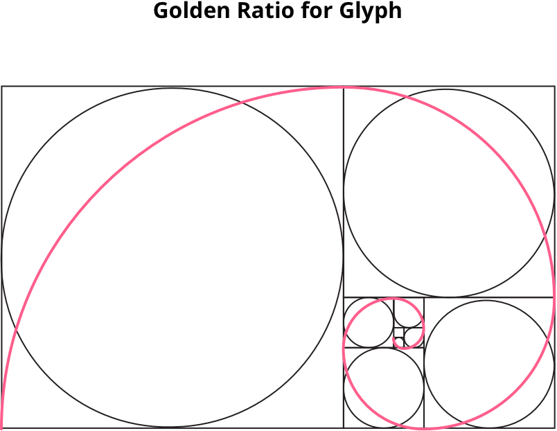
The old one was weird. It just seemed like the least appropriate type selection for a free-style startup, and I need to make some updates to the identity design to distinguish it from former eras of saihu. New logo needed to feel fresh, fun and delighted.

Usage Example
In order to make sure this stays fairly consistent, brands have identity guides and brand style guides. and also shares the colors of the brand as well as other things.




Color Palette
I have created a pack of different colorway for company to use and implement to design, combinations and that will represent for Saihu's brand.
- Saihu Dark#B23055rgb(178,48,85)
- Saihu Click#CC4B70rgb(204,75,112)
- Saihu#FF5E8Crgb(255,94,140)
- Saihu Hover#FFAAC3rgb(255,170,195)
- Black#000000rgb(0,0,0)
- Dark Grey#5C5C5Crgb(92,92,92)
- Grey#909090rgb(143,143,143)
- Light Grey#D5D5D5rgb(213,213,213)
- White#ffffffrgb(255,255,255)
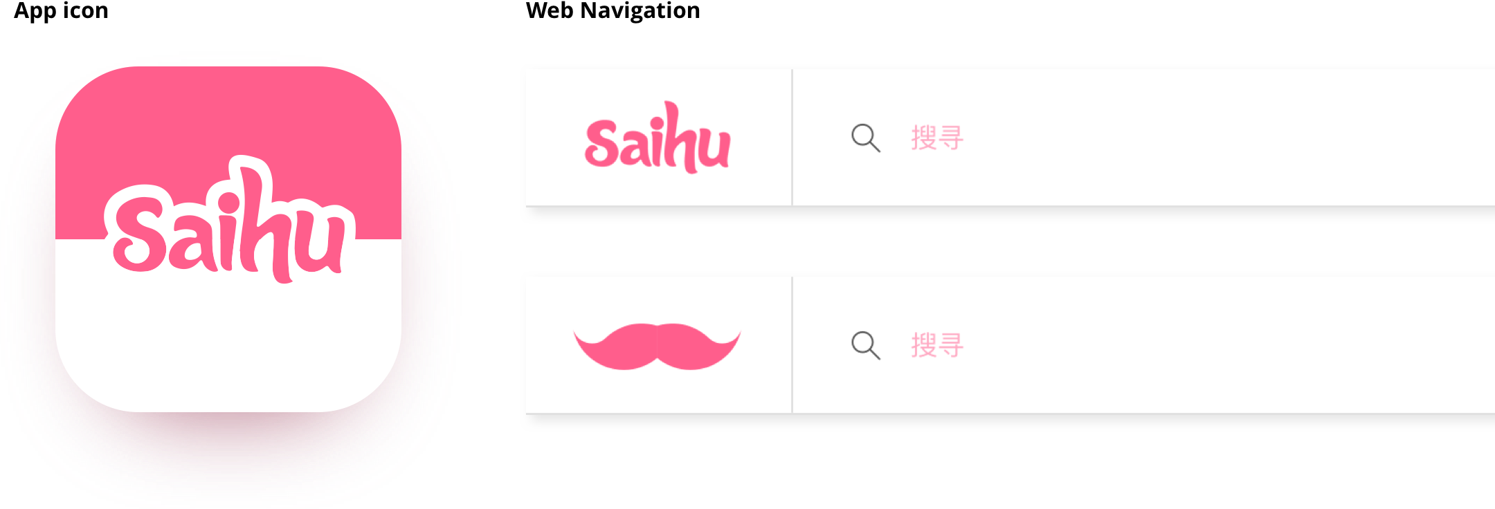
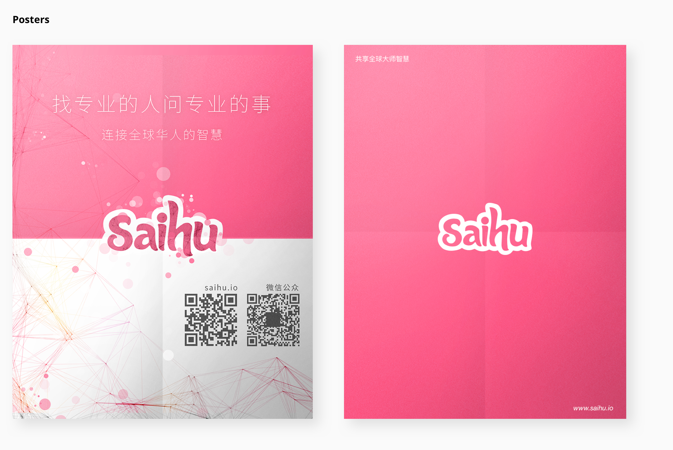
Display in different media.

Design Work
Branding
Design Pattern, Graphic Design, Typographic, Color Palette, Logo
more details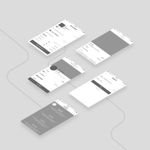
Interaction Structure
User Flows, Information Structure, Interaction, Element, Wireframe
more details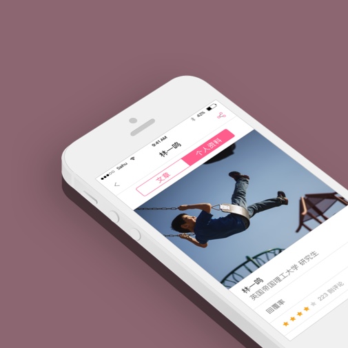
Mobile Interface
Interface, Mockup, Design Process, Usability Enhancement
more details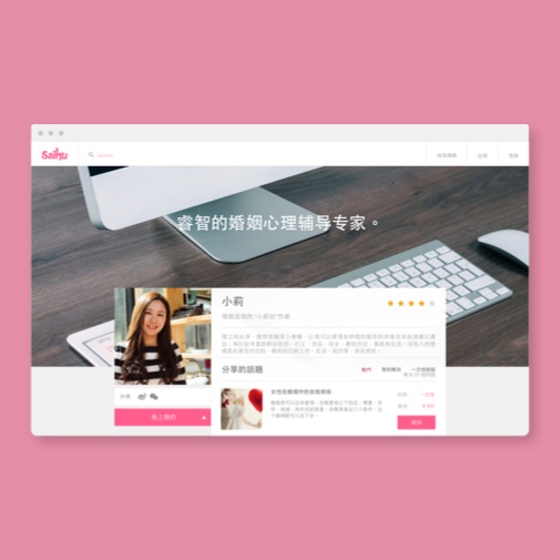
Web Design
Interface, Mockup, Grid, Responsive Design
more details
“ Create any possibility of flowing knowledge. ”
Carlos Wang CEO @ SaihuX Inc.